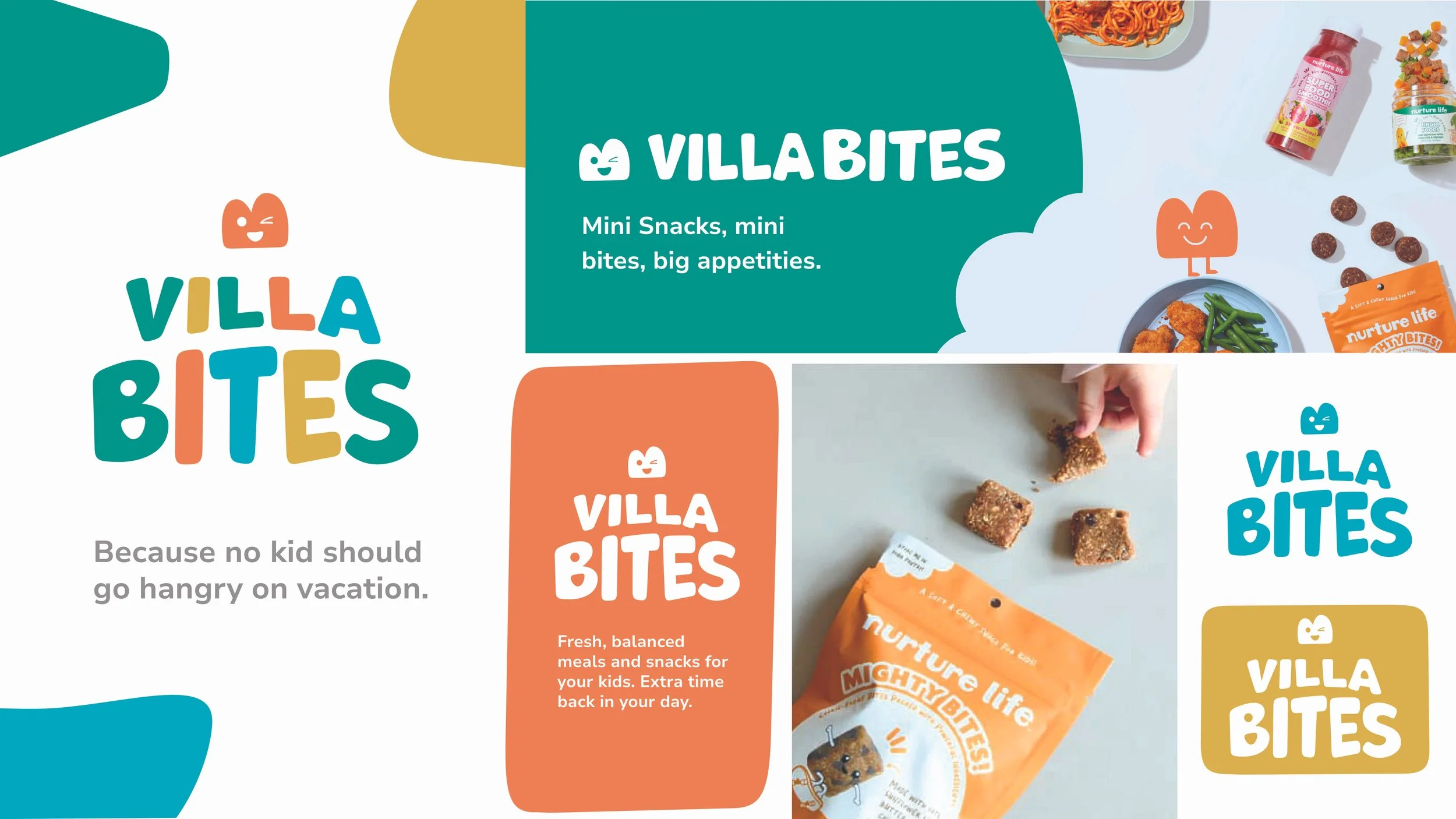
Villa Bites Branding
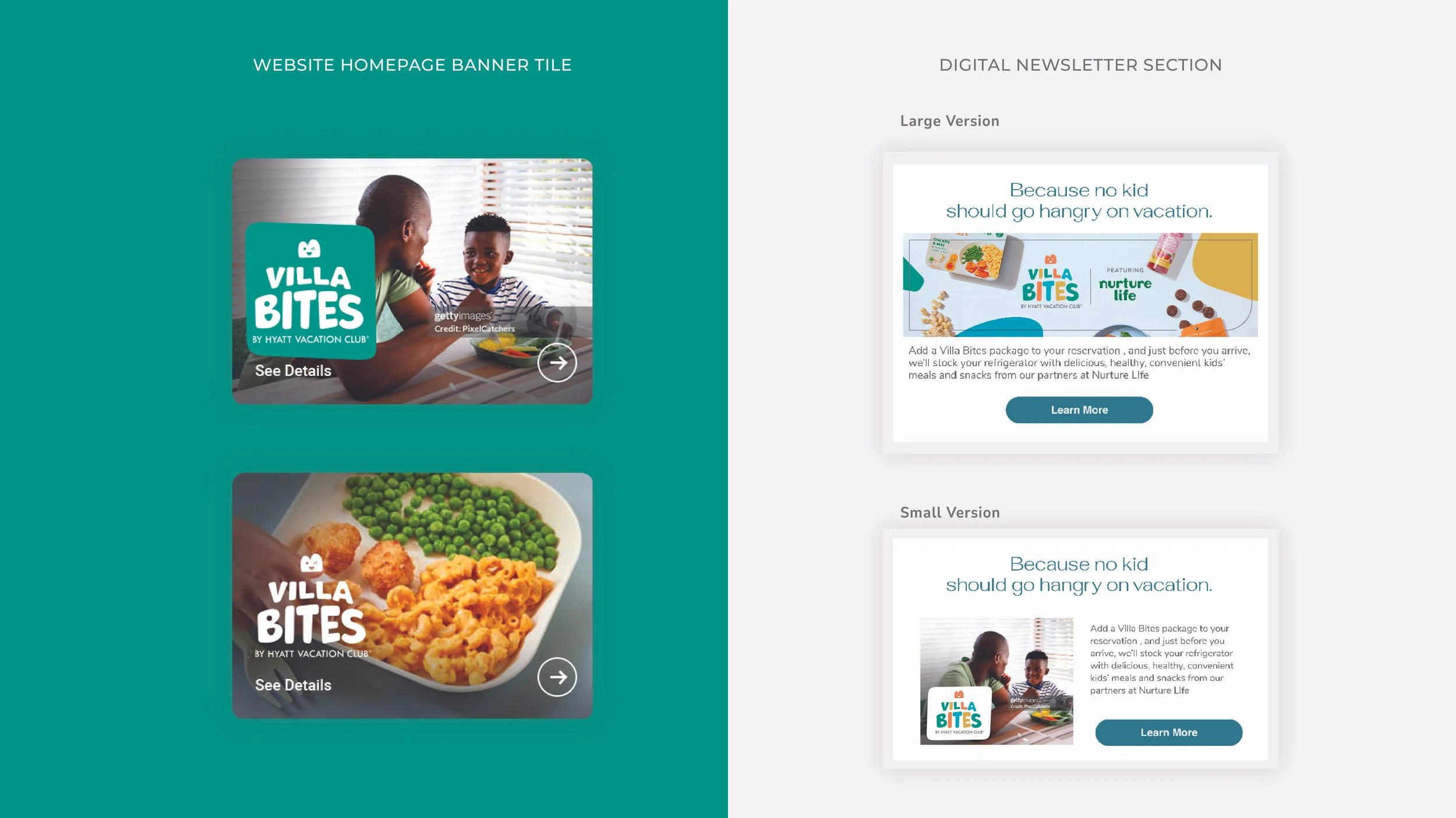
Objectives
Create a playful, joyful, and illustrative identity that appeals to both children and their parents.
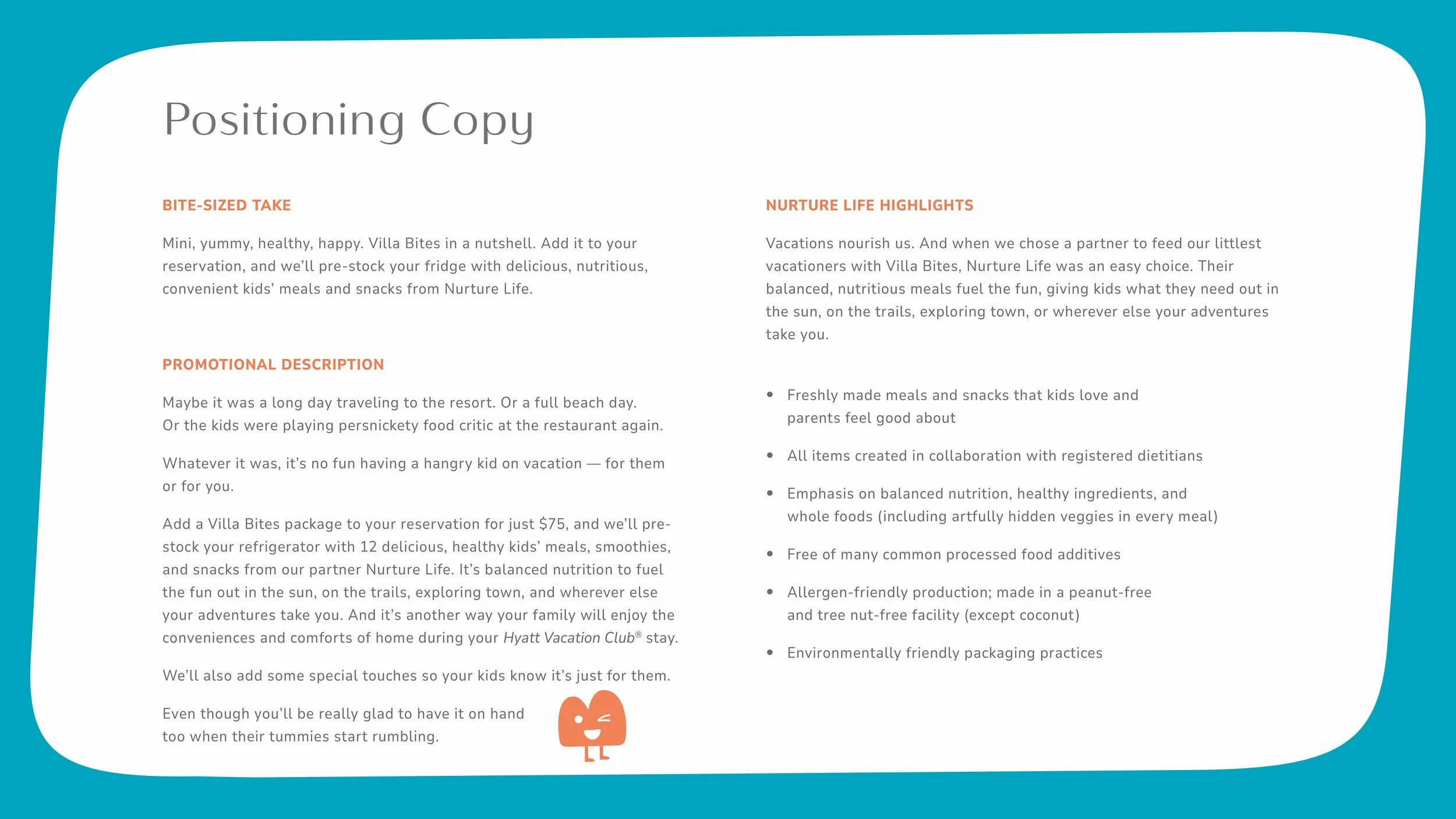
Communicate convenience, delight, and approachability through visual and verbal elements.
Develop a toolkit that is flexible enough to apply across digital and physical touch points.
Highlight keywords that guided the design: joy, surprise, playful, illustrative.

Design Approach
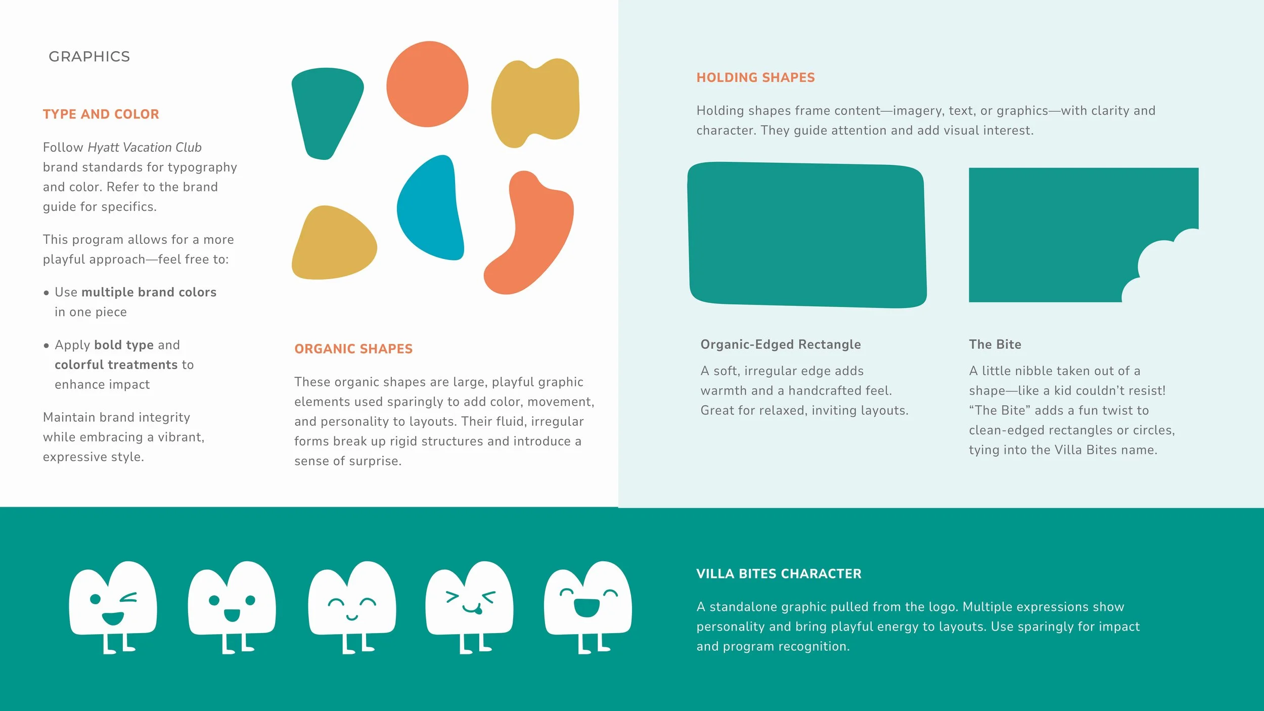
Typography: Rounded, friendly typefaces that feel approachable and playful.
Color Palette: Bright, energetic colors that evoke excitement, happiness, and appetite appeal.
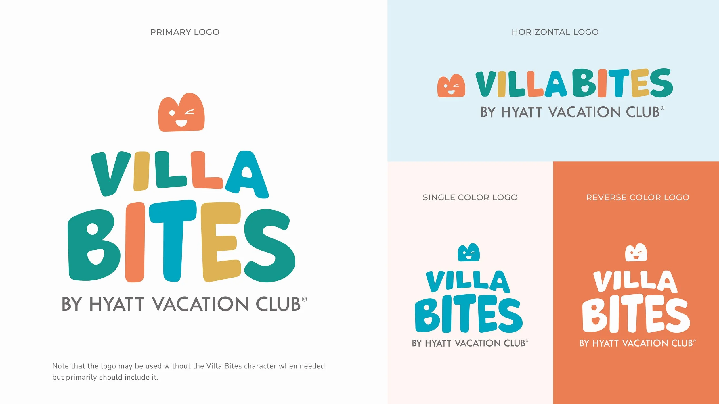
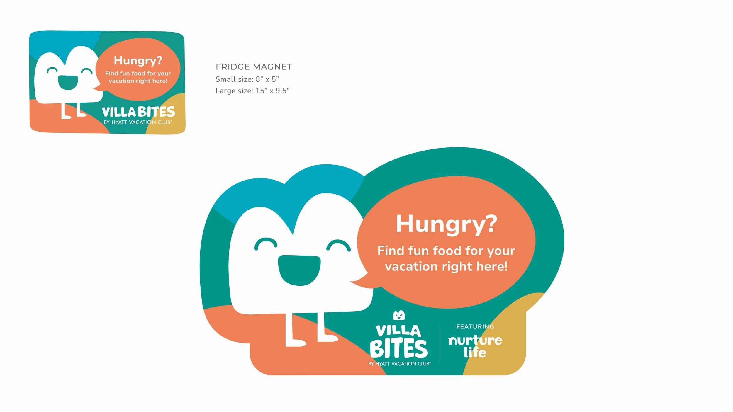
Character Integration: Transforming letters into characters — for example, the character is the “B” in Bites, smiling and winking, giving the brand personality and charm.
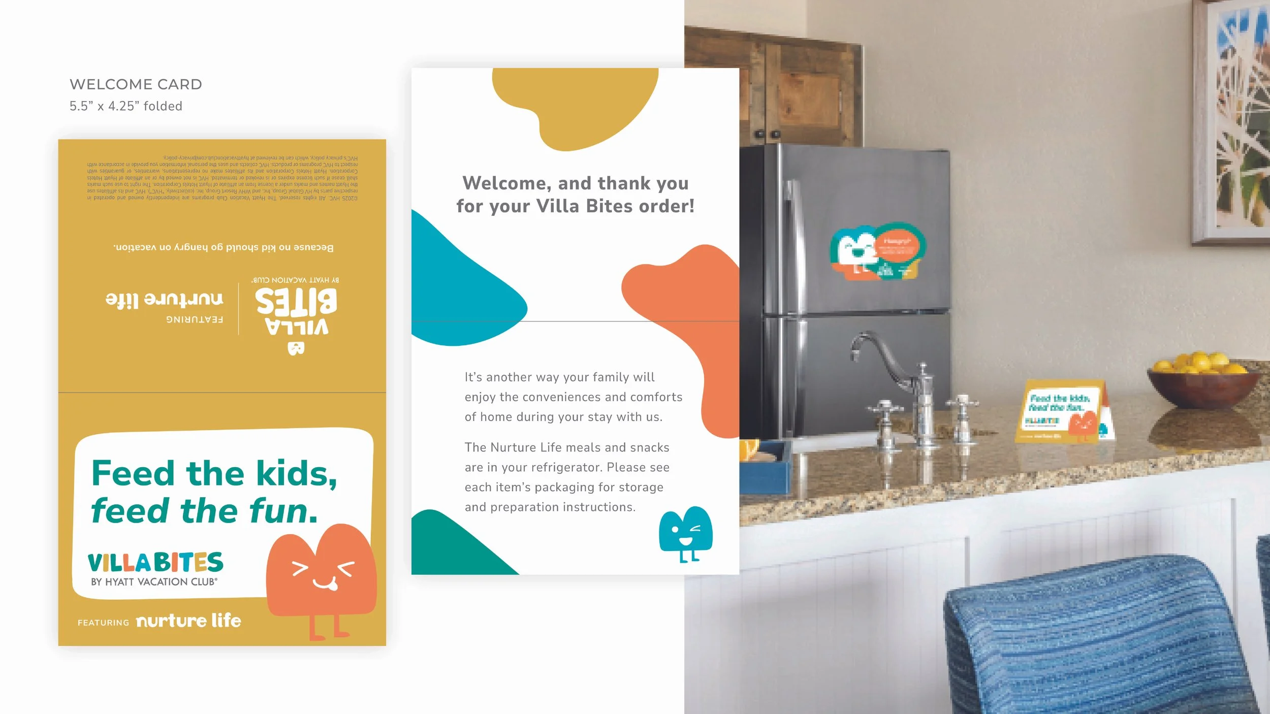
Tone of Voice: Cheerful, lighthearted, and conversational, reinforcing a sense of fun and ease while reassuring parents about the program’s convenience.
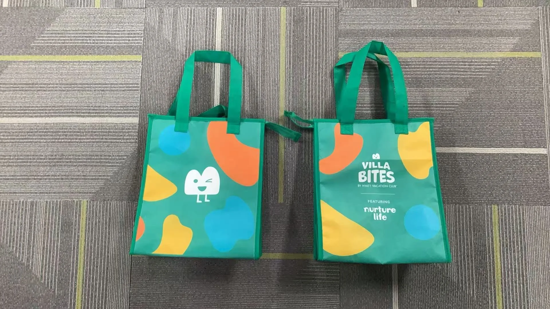
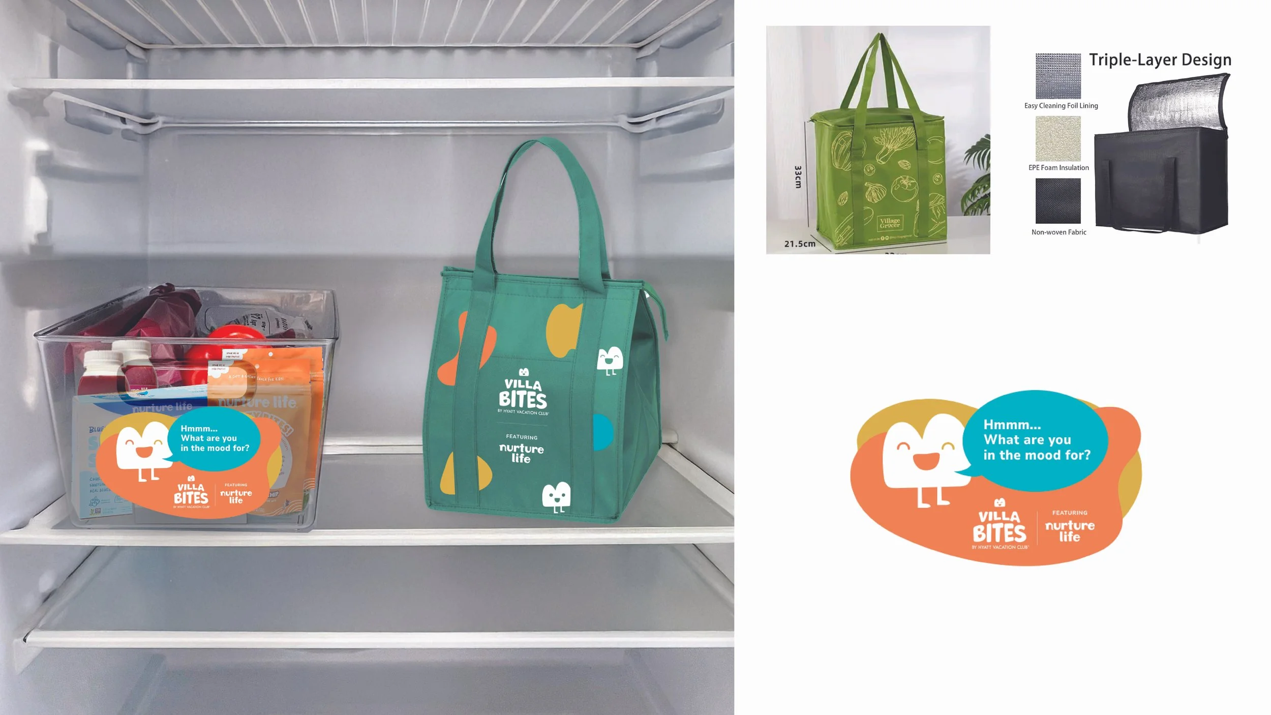
Produced Villa Bites branded in-fridge insulated bags for food storage
